Resource
Measuring changing landscapes with EarthMosaics
A common practice for many earth observation analytics groups is to build composite image products, also called mosaics. Mosaics serve numerous purposes, including achieving spatial coverage from multiple images by selecting data from a specific time of interest in which the signal is most available for extraction. Land cover change is a vital mapping input into ecosystem, climate, and carbon sequestration models, and wildfire mitigation and remediation. High-quality cloudless mosaics appropriate for mapping inter-seasonal differences have been historically costly, time-consuming, and complex enterprises. As such, large-area projects that require accurate mosaics are often only released sporadically every few years.
These large-area products help monitor natural landscapes as they undergo regular and irregular changes. However, making sense of change is a spatial-temporal challenge that often requires contextualization of multiple images rather than a single snapshot in time. For example, Standardized Precipitation Index (SPI) uses a historical look at the rain from 1 to 36 months. It is not only when these SPI snapshots take place that matters, the sequence of events and contextualization of local and regional land cover can also be understood using temporally coherent seasonal mosaic products.
Both temporal and spatial coverage are vital to human and machine understanding of landscape change. By using the EarthMosaics service, accessible custom mosaics can quickly zoom in on areas of interest while maintaining cloud-free data consistency across the landscape. EarthMosaics deliver this possibility through proprietary technology to compile, correct, and serve scientific-grade mosaic products at any scale.
Changing Waters
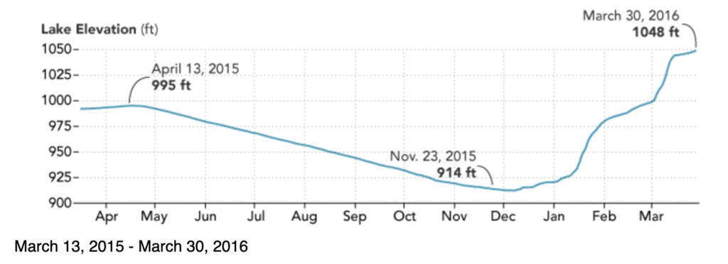
In 2016 NASA published “Water Levels Rise on Shasta Lake” to denote the rapid recovery that was happening after a long drought in the Northeast Subregion of California, including the three major river basins: the Upper Sacramento River, McCloud River, and Pit River. These basins generally flow into the north and northeastern parts of the Sacramento River Basin, Lake Shasta, and the Sacramento River.
With optical Earth Observation data, we only get a snapshot in time, a glimpse into a moment that can be obscured by local conditions, including weather, drought, clouds, and smoke. There is also short-term land cover variability from changing phenological conditions to crop rotations. Seasonal mosaics refine the vast amount of data required to minimize inter-seasonal changes and build a representative cloudless image composite ready for analysis.
(Left) The 2016 year was a high watermark for the lake, a period of recovery from previous droughts described in the article and shown by this supplied figure of water.
(Right) In 2021 however, this is the second lowest ever water mark.
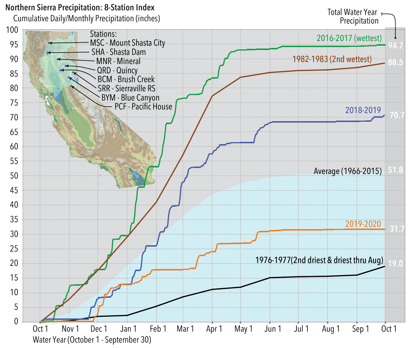
The water regime history goes beyond single snapshots by taking cumulative measurements made year over year and integrated over the landscape. Looking at hydroclimatic data provided by California’s Department of Water Resources, we can further observe that 2016, 2017, 2018, and 2019, marked high water precipitation years for the Northern Sierra region. We should expect to see higher water levels and increased greening of vegetation followed by a drop in 2020 and into 2021, as indicated by the last orange line.
Geographic Information (including Earth Observation) is all about context, both in space and time. Applying broader context to individual field measures from rain and streamflow gauges helps us to understand the local to regional impacts that matter to farmers, forest stand managers, urban planners, policymakers from local, regional governments, and national governments. Spatial-temporal information always improves context. Using EarthDaily Analytics’ EarthMosaic service allows you to map surface water, forest drought stress, wildfires, land cover and land-use change as well as monitor ecosystems for important changes, all with pristine, cloud-free, seasonally coherent image mosaics.
The summer time series of Shasta lake from 2016-2021, processed and prepared using EarthMosaics service.
The first year of recovery in 2016 is clear in the animation above. Additionally, in 2016, things look ‘normal’, or more appropriately, close to average. As we pass from the spring season into summer, year by year, dryer conditions become apparent, culminating in 2021, when drought set records as the lake found itself at 24% of maximum capacity. Only once before in 1977 had there been a worse year. Capturing the changes in the landscape from season to season, year-to-year data is now possible with EDA’s EarthMosaic service.
Drought and Land Cover
U.S. Geological Survey’s National Land Cover Database (NLCD) over 5 years provides a broad synoptic view of land cover change over the continental USA and is built with the support of several agencies. This land cover product captures a specific snapshot in time, which can change much faster based on local conditions than the update frequency of ~3 years.
U.S. Geological Survey’s National Land Cover Database (NLCD) for 2016 (left) and 2019 (right) and clipped to the region of interest.
These changes are easy to highlight by rendering them in the available mosaic range, 2016 and 2021. Incorporating additional bands and seasons provides complimentary new measurements of the landscape that inform broader impacts on vegetation, debris, and moisture.


Red ellipses to highlight some obvious areas of interest for likely change in 2016 (left). Blue and Red ellipses highlight some obvious areas of change in 2021 Summer (right).
In the above example, I use red ellipses to highlight some obvious areas of interest for likely change in 2016. Generally, these are areas with active logging. When we contrast them to both the red and blue ellipses in the 2021 summer image, more apparent and widespread changes can be observed, including general browning and logging cuts in some areas of the landscape.
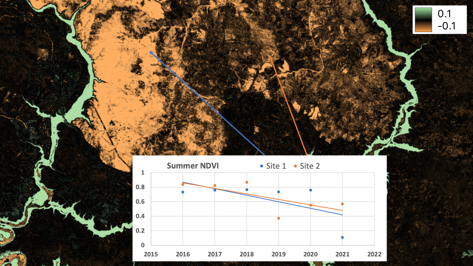
Each composite, over each time of interest, speaks to that moment on the landscape and can be used to draw a deeper understanding of that change. We can measure these changes by looking at points of interest through time. The example below shows the trend of Normalised Difference Vegetation Index (NDVI), which can be used to quickly look at broad contextual trends on the landscape that add value to existing products, such as the NLCD Product.
This complimentary analysis can identify similar regions of change, including changes that happen after or in 2019. This includes changes that are not typically included in mapping exercises, such as changing water levels. Using the slope of NDVI data over time, a temporal water mask (where NDWI > 0), and a mask little vegetative index change (where the range NDVI values > 0.2) can be made to filter for regions of substantial NDVI change; let’s call this an NDVI slope map.


NLCD (Left) mapped to 2019 only showing changes from 2016. NDVI Slope Map aggregated into regions of change. (Right).
When we zoom into specific areas, such as these well-highlighted areas of cuts in both the NLCD LC and the NDVI slope map, each contains similarities and discrepancies depending on time of disturbance. The NDVI slope map additionally highlights the regrowth trend from earlier cut areas.


Zooming in and clipping on an active forest cut areas we can quickly visualize change. (Left) True Colour RGB Image from Summer 2016. (Right) True Colour RGB image from summer 2021.


Using the same clip area above, NLCD (Left) mapped to 2019 only showing changes from 2016. NDVI Slope Map aggregated into regions of change. (Right).
We can also look at broad landscape changes to see what we are learning from this time-centric data.


Zooming in on a large fire area in the northern portion of the image, we can quickly visualize different changes. (Left) Shortwave infrared colour image from summer 2016. (Right) Shortwave infrared colour image from RGB image from summer 2021.


Using the same clip area above, NLCD (Left) mapped to 2019 only showing changes from 2016. NDVI Slope Map aggregated into regions of change. (Right).
We can see large similarities and discrepancies between this NDVI slope map and the land cover change. Large areas of fires in the north and west of this image are captured by both the NLCD LC and the NDVI slope map, but the most recent fires are not at all captured by the NLCD LC map, even though they happened in 2019. Water areas, shown as increasing NDVI in the NDVI slope map, are well represented. It is important to note here that an increase in NDVI signal would almost certainly happen as any landscape transitions from aquatic to terrestrial due to the nominal response for NDVI in water being so low. In this case, bright, bare sediment and/or rocks show this increase, even though little vegetation is present. The land cover map shows a broader filling of green, whereas the NDVI slope map shows little. This is because the NDVI slope map has been constrained to seek high change areas, defined by their spread in the data. This is a simple example of applying EarthMosaics for rapid analysis possible. Annual time series products that have been atmospherically corrected, masked of clouds, normalized, and quality-assured for machine-learning applications enable seasonal to long-term analysis over custom areas of interest.
EarthMosaics are a powerful pre-analytic product that provides a spatial and temporal baseline that is temporally and spatially accurate, radiometrically consistent, and flexible to different use cases. To learn more about Earth Daily’s EarthMosaics service visit our website or contact us at info@earthdaily.com.